ShopDreamUp AI ArtDreamUp

Deviation Actions
Oldies but Goldies
Previous posted old stories but available after numerous requests to repost. All hand drawn and a little rough and ready femdom themed drawings!
$3/month


Suggested Deviants


Suggested Collections


You Might Like…


Description
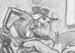
My term-long project for my Senior Studio class has been working and reworking the designs and colors for these five characters from my series Phantom Run.
From left to right, the characters are: Thaine, Saiph, Kisa, Teddie*Maru, and Twir. I've made a few minor changes to the story, too.
The plot is still the same, but Kisa is a bit younger than I originally intended and the story is set in San Francisco instead of Shinjuku. For those of you wondering why Kisa still has the name Kisa if it's not an American story, her name is actually Russian for kitten.
In any case I've been having a lot of fun working on this, very inspired by Jamie Hewlett's artistic style. I think I'm going to look at Shirow Miwa and Oh!Great's styles as well, since they have that urban feel that I like, but I want to keep it less on the anime side of things. And I need to thank for the logo on Kisa's shirt, which I played around with a bit on the colors.
From left to right, the characters are: Thaine, Saiph, Kisa, Teddie*Maru, and Twir. I've made a few minor changes to the story, too.
The plot is still the same, but Kisa is a bit younger than I originally intended and the story is set in San Francisco instead of Shinjuku. For those of you wondering why Kisa still has the name Kisa if it's not an American story, her name is actually Russian for kitten.
In any case I've been having a lot of fun working on this, very inspired by Jamie Hewlett's artistic style. I think I'm going to look at Shirow Miwa and Oh!Great's styles as well, since they have that urban feel that I like, but I want to keep it less on the anime side of things. And I need to thank
for the logo on Kisa's shirt, which I played around with a bit on the colors.Image size
5400x2550px 4.91 MB
© 2010 - 2024 MissTooni
Comments23
Join the community to add your comment. Already a deviant? Log In
Alright, time to critique since that's what you stated in the picture thingy for the pic.
I'll start off by saying that I like the picture in all it's fun ness.
(And I will also state, as you already know of me, I'm brutally honest when someone asks for my "Real" opinion on something.)
Alright
Individual characters (left to right)
Thaine
Positive
Probably my favorite one of the group for a few reasons. First, I mean come on his outfit is just great. Love that he also seems somewhat elegant for the way he's holding his Pipe. And his outfit just must be his color cause it really works for him for some reason.
not so Positive.
His right arm really bothers me for the fact that his clothing sticks straight out and doesn't rest against his hand, while the left arm his clothing shows gravity and rests on his hand. And then While the bottom half shows shading to indicate the cloth has dimension, the bottom of it really seems to make it look really cone like and for me it loses the dimension there.
Saiph
Posotive
Well for this guy, I think you did really well expressing his personality through his posture, and his outfit which goes right with it. He appears to be a very suave smooth talking person and also seems to look as though he's really interested in Class...or just money. The clothing shows good dimensions and really looks natural for his outfit. And the colors are really well selected.
Not so Positive
Well as stated before, the fact that he is clenching the margarita glass with a fist really throws off the suave look and makes him almost look like he's gonna pound someone in the face if they say one more word. Another thing that I know you it sucks drawing hands, but one hand is behind his back. I know some people put there "Hands" behind there back, but not normally just one hand. When I look at his stance I seem to want his left hand to be resting on his hip or something. Also the detail around the right eye makes that part look flat. This last part is really just nitpicking but it still bothers me that his undershirt has no buttons on it...and...dress shirts like that have buttons...and white ones stand out way more then say a black one. And finally...just not sure what that dot is on the bottom of the shoe.
Kisa
Positive
She is probably one of your best drawn characters in this picture. The variety of things in her outfit makes her the center of attention in this picture. When people look at this picture at first glance, she will probably be the one people notice first. The colors and many different things on her really draws the attention of the eye. The detail was put into her very well overall and really brings out her character. The shading is great for the art style and she really just looks like a fun character. And I LOVE the Cloud Strife Boots lol (pretty sure u didn't base them off him, but omg that's them)
Not so Positive
Not really much to say here.....she's just so fun looking. I guess the only thing I can say is more of a personal thing which is I think her pants could use a little more detail....but I know some style's of pants are just like that so it really can pass for pants.
Teddie Maru
Positive
Looks like a really cute ghost that you could play with for hours and not get bored with. His color is different from your traditional ghosts and so that adds uniqueness to his character. He also has what looks like a patched eye or fixed eye to add the quality that he must have been a loved teddie bear. So overall he's just really a cute little ghost.
Not so Positive
Once again I can't really say much for this for one...since it's just a creation of yours...so how it looks....should be completely up to you. The only real thing that bothers me is yet again his right hand. And in this I only am bothered because you can see the sketching of his fingers, but then you also see that the darker dominant line is traced to make it appear like it's just a round hand.
Twir
Positive
This is your second best drawn character in this picture I believe. There is a good amount of detail throughout his entire body. Again his outfit is different and outta the norm so he get's plus points for that. The hair is really fun since it's dreaded I believe. And his skin tone is actually different from the rest. This actually shows that you have different colored people as opposed to the typical one color for all people.
Not so Positive
Ok I'm starting to think you really like making something in the right arm something I tend to think has something not so normal about it. In this one, kinda like the first character...his arm kinda just looks stiff and not in a very comfortable position. Don't know many people who would hold it like that unless they were acting strange. If I'm not mistaken, his left leg actually appears to me to be smaller the the right one. And lastly, his face. I'm not sure if it was intended or what's going on here. But with his right eye open as it is, makes half his face look like he's a pretty laid back guy. While his left eye makes him appear to be a happy go lucky child who wants to look at rainbows and unicorns...kinda like Bubbles from Power Puff Girls. Can't seem to get past that one thing though.
Overall
Positive
I really like that I can see a good amount of detail in each character and that it really shows each character and what their possible way of life is through an emotional level. Good job on it and keep working hard to make your art even better then it was before.
Not so Positive
Personally I'm not a fan of the sketchy lines mixed with the colors. I know it's a style some people like, but I've never really been a fan of it. The background while yes is fine for showing each individual character, I personally prefer pictures to have some kind of background no matter what. Again that's just me personally. Naturally each character seems to have some little thing about it that could probably be worked on. And finally I wish each character stood out as much as the other since I believe this is a picture defining each individual character.
Anyways, that's my critique and I hope you don't take any of it as a major negative that hurts your feelings. Like I said, when something is asked to be critiqued, I try to be as honest as possible. Keep drawing and keep improving your skills and you can become one of the most amazing artists out there.
Later ^_^